Magazine [SAME] Double Page and Front Cover Analysis

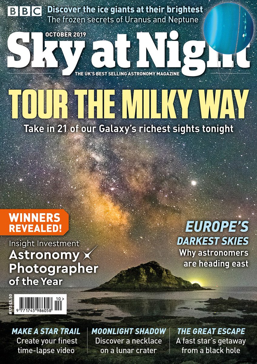
It is clear that the magazine is exploring the wonders of the milky way and ultimately, the unknown of astronomy beyond the human vision. And so, therefore, the correlation of the front cover and the double page spread is that they both have indistinguishable features of looking at the milky way. The double page spread is giving instructions on how to observe, and the best way to capture the milky way; via using a tripod and the front cover is actively showing the milky way and giving you hints that this is the content that will be shown throughout the magazine. Therefore, the designers are making clear links to each other.
On the front cover, there already is a mass amount of writing in small font; a verbal code and symbolic code (images of the universe), that portray what is going to be discovered within the magazine. Therefore, the fact that inside, the amount of writing and imagery there is are both plentiful is to be expected and understood. So the designers
This further gives of the impression that the designer has made this magazine specifically for the mature and older audiences. Obviously, also anyone who is a space fanatic, but especially the older people because of the amount of writing, reading and sophistication this magazine brings. There are many concepts and different analysis' or interpretations that someone who is younger may not understand.


Comments
Post a Comment